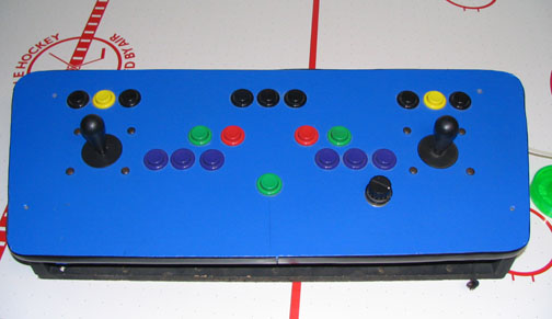
Since the control panel is the center piece of the whole thing, I decided to start there. Here is my first draft of my CPO (Control Panel Overlay). The second image is a pseudo mock up of the button layout. My idea is that the right player will have a 7th button below the main buttons to the lower left. This can act as hyperspace / shield for a Gravitar, or Asteroids type layout. The left player will have a button above the main set to form a diamond for Vanguard. I always liked Vanguard but I really suck at it.
For the graphic design, I tried to capture the feeling of 80’s machines in general. It’s kind of like an abstract construct of a Space Invaders type thing. My intention is to also make a stencil for this and then do a spray version on the side of the cabinet, like the look of the old Williams games.
I made a desktop CP (Control Panel) a few years ago that I liked, but the spacing was a little too close together. I need to look at CP Sketcher and make the grid smaller so I can scoot them a little closer and still keep the alignment.


